
The Basics
The image above shows a homemade loom made simply from cardboard and string. The white strings you see running vertically are called warps. They are what you run your weave over and under to create your image. The fabric you use to go over and under is called the weft. Moving the weft over and under the warp creates your image. If you want to build your own loom, go to the following page:
Weaving My Initials

The image above can be used to weave the initials MM into a piece of fabric using a loom with relative ease. First, let’s go over the color coding. The green boxes establish where the pattern starts and ends. This isn’t part of the pattern itself, but it simply establishes the point where you move up from the current row, or warp, you are on. As a general rule of thumb, you should start from the bottom left and finish in the top right of your loom. The gray boxes establish the background of the initials; this is where the fabric should be run under the warp.
So, in this instance, we are starting at the green “1” box and working right. The weave should be run over the first warp string, then under the following seven warp strings before coming back over the last warp string. Next, we want to wrap the weave into the next row, or weft, by simply following the arrow. This time, we will bring the weave under the first two warp strings, over the third, under the fourth, over the fifth, under the sixth, over the seventh, and under the final two warp strings. If you follow a similar process while referring to the image, going over warps that are blue or green and under those that are gray, you will have your completed weave. If you want to make your own weave, go to the following video for tips and rules to follow:
")

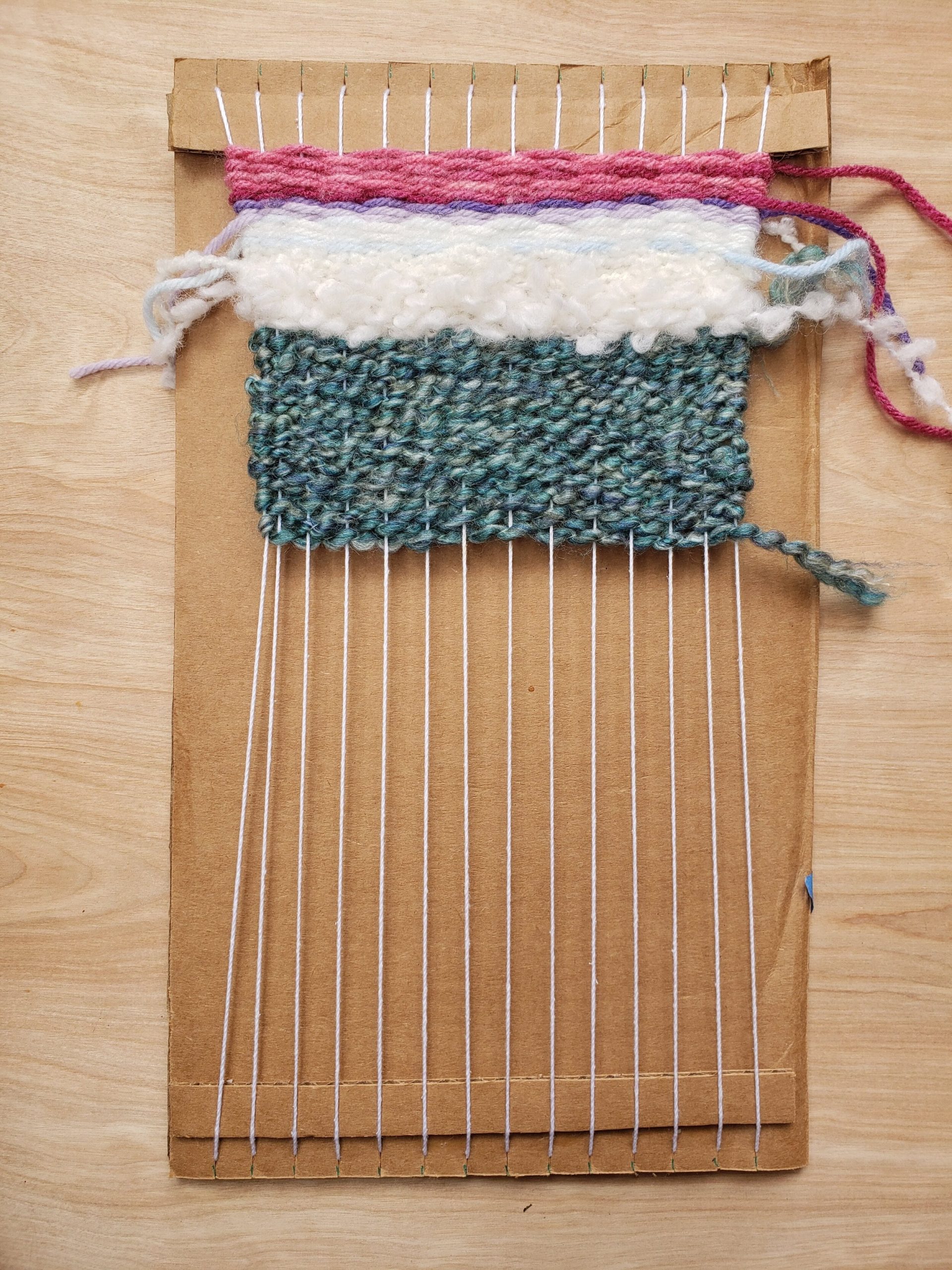
Notice how different the above images are from the template shown above. This highlights some of the gains and losses from the digital representation to the “natural” representation. With the actual object we can see how it really pops in 3D opposed to flattened boxes. We also have the addition of texture which really lacks in the digital representation. What other changes do you notice in the digital vs physical representations?
Perhaps you noticed right away the color differences, the ability to make the digital representation a mere template to future editions. The digital version will always be the same, however the colors, size threads, and exact sizes of every physical copy are going to vary. This once again highlights the fundamental differences between analog and digital. Digital copies are indistinguishable from the original. Analog copies are easily distinguished from one to the next.
All content on this page was checked for grammar, punctuation, and spelling using Gemini 2.0 Flash AI on 2/17/25 using the prompt “please check the following for grammar, punctuation, and spelling”.
Trackbacks/Pingbacks